
Better Color Picker
Better Color Picker adds a color picker element to a Bubble page. Use it when a user needs to choose a color and your app needs the selected value in workflows, database fields, styles, or dynamic expressions.
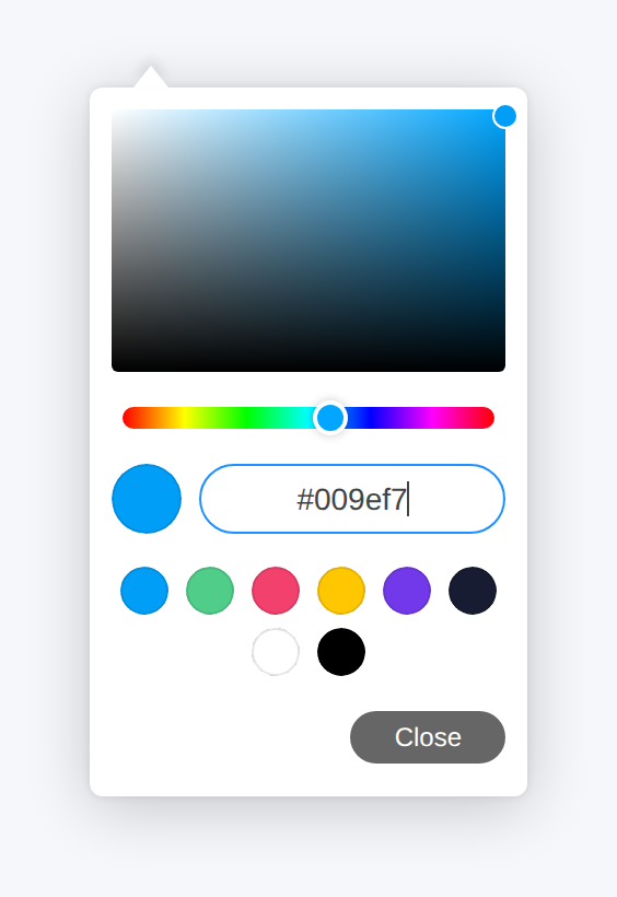
The element can use the browser's native color picker or the modern picker UI with themes, optional opacity, format controls, and swatches from a Bubble list of text values.
Quick start
Add the Color picker element to the page.
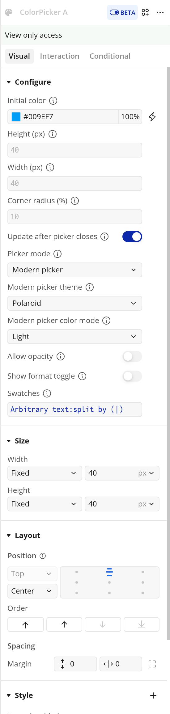
Set Initial color to the color the picker should show before the user changes it.
Choose Picker mode:
Native browser picker uses the user's browser and operating system color picker.
Modern picker uses the styled picker with theme, opacity, format, and swatch options.
Set Height (px), Width (px), and Corner radius (%) to match your page design.
Use the Selected color state wherever your app needs the chosen color.
Add a workflow for the Color changed event if you want to save the color, preview it, or update another element.
Element reference
Add one Color picker element for each color value the user should choose. The element publishes the selected color as a hex value.
Fields
Initial color: The color shown before the user selects a new color. Default:
rgba(0,158,247,1), which displays as#009ef7. Use a Bubble color value, hex color,rgb(), orrgba().Height (px): Height of the visible color picker control in pixels. Default:
40.Width (px): Width of the visible color picker control in pixels. Default:
40.Corner radius (%): Roundness of the visible picker control, as a percentage. Default:
10.Update after picker closes: Controls when the Selected color state and Color changed event update. Default: enabled. When enabled, the selected color updates after the picker closes. When disabled, it updates while the user is dragging where the browser or picker supports live color updates.
Picker mode: Choose
Native browser pickerorModern picker. Default:Native browser picker. Use Modern picker when you want a consistent picker UI with swatches and optional opacity.Modern picker theme: Theme used when Picker mode is set to Modern picker. Options:
Default,Large,Pill, andPolaroid. Default:Default.Modern picker color mode: Color mode used when Picker mode is set to Modern picker. Options:
Light,Dark, andAuto. Default:Light. UseAutowhen the picker should follow the user's browser preference where supported.Allow opacity: When enabled, the modern picker can return 8-digit hex colors with alpha values. Default: off. Leave this off when your database field or style expects normal 6-digit hex values like
#009ef7.Show format toggle: When enabled, the modern picker shows controls for Hex, RGB, and HSL. Default: off. The plugin still publishes the selected value through Selected color.
Swatches: Optional list of color text values to show as swatches in the modern picker. Default: empty. Leave this field empty to hide swatch circles.
Swatch example
To provide static swatches, pass a list of text values such as:
#009ef7
#50cd89
#f1416c
#ffc700
A simple way to set a static list is to use Arbitrary text:split by. For example:
#009ef7|#50cd89|#f1416c|#ffc700Split it by | and pass the resulting list to Swatches.
Exposed state
Selected color: The currently selected color as a hex value, for example
#009ef7. When Allow opacity is enabled in Modern picker mode, this can be an 8-digit hex value.
Event
Color changed: Runs when the user selects a new color. Timing depends on Update after picker closes.
Example workflow
To let a user set a brand color:
Add the Color picker element to the settings page.
Set Initial color to the current brand color from your database, or use a default color.
Set Picker mode to Modern picker if you want the styled picker and swatches.
Add swatches if you want users to choose from approved brand colors.
Create a workflow using the Color changed event.
In that workflow, make changes to the relevant thing and set its color field to the color picker's Selected color state.
Use the same state to preview the chosen color elsewhere on the page.
Troubleshooting
The selected color does not update while dragging
Disable Update after picker closes if you want live updates. Some browsers only send color changes after the native picker closes, so test the behavior in the browsers your users rely on.
The picker shows the default blue color
Check that Initial color is a valid Bubble color, hex color, rgb(), or rgba() value. Invalid or blank values fall back to #009ef7.
No swatches appear
Make sure Picker mode is set to Modern picker and Swatches receives a list of text values. If Swatches is empty, the plugin intentionally hides the swatch circles.
A swatch does not appear
Check that the swatch value is a valid color text value, such as #009ef7, 009ef7, rgb(0, 158, 247), or rgba(0, 158, 247, 1). Blank or invalid list items are ignored.
The color picker looks larger or smaller than expected
Set both the plugin fields and the Bubble element size. Height (px) and Width (px) control the picker inside the element, while Bubble's layout controls the element's box on the page.
Limits
The plugin is web-only.
Native picker popups are controlled by the user's browser and operating system, so exact behavior varies by browser and device.
Modern picker mode gives a more consistent UI, but it still runs in the browser and should be tested on the devices your users rely on.
If Allow opacity is enabled, make sure the rest of your app can handle 8-digit hex values.