
Better Loading Animations
Better Loading Animations lets you add lightweight animated loading spinners to Bubble pages. Use it for loading states, waiting messages, empty-state placeholders, or any moment where the user needs to know that something is still happening.
Quick start
Install the plugin in your Bubble app.
Open the page where you want to show a loading animation.
Add the Loader element to the page.
Set Loader Style to the animation you want.
Set Loader Color to match your page.
Set Loader Width and Loader Height to control the visible animation size.
Use Bubble visibility settings, conditions, groups, or workflows to show and hide the loader when work is in progress.
You do not need to add a workflow action. This plugin is a visual element: place it where the spinner should appear, then control its visibility with Bubble.
Example use cases
Show a loader while a repeating group is waiting for data:
Place the Loader element in the same area as the repeating group.
Set Loader Style to
Dots,Pulse,Spinner, or another style that fits the page.Set Loader Color to your app's accent color.
Show the loader when the repeating group's data is loading.
Hide it when the content is ready.
Show a loader inside a button or compact group:
Add the Loader element inside the group.
Use a smaller Loader Width and Loader Height, such as
24or32.Use Loader Color that contrasts with the button or group background.
Show the loader while the workflow is running, then hide it after the workflow finishes.
Loader element
Add the Loader element from the Visual elements section of the Bubble editor.
Loader Color
The color used by the loader animation.
Default: rgba(0, 158, 247, 1).
Use your app's accent color for general loading states, or use semantic colors when the loader belongs to a specific context.
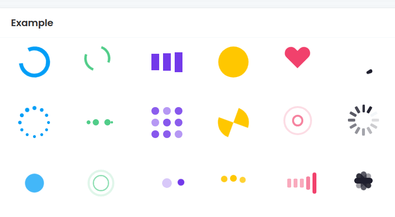
Loader Style
Choose the animation style.
Default: Spinner.
Options:
RingDual-RingFacebookCircleHeartRollerDefaultEllipsisGridHourglassRippleSpinnerPulseTwin PulseOrbitDotsWaveBars
The newer, more modern styles are Pulse, Twin Pulse, Orbit, Dots, Wave, and Bars.
Loader Width
The visual width of the animation, in pixels.
Default: 40.
Use smaller values for inline loaders and larger values for page-level loading states. The Bubble element itself also needs enough space on the page to show the loader without clipping.
Loader Height
The visual height of the animation, in pixels.
Default: 40.
Most loader styles look best when Loader Width and Loader Height are the same value. You can use different values, but some styles are designed as square animations.
Controlling when the loader appears
The plugin does not decide when something is loading. Bubble does.
Common patterns:
Hide the loader on page load, then show it at the start of a workflow.
Hide the loader when the workflow finishes.
Show the loader conditionally when a group, search, or repeating group is loading.
Put the loader inside a group and show or hide the whole group when needed.
Troubleshooting
Nothing appears on the page:
Make sure the Loader element is visible.
Make sure none of its parent groups are hidden.
Check that Loader Width and Loader Height are positive numbers.
Check that Loader Color is not transparent or the same color as the background.
Make sure the Bubble element box is large enough for the loader.
The loader is clipped:
Increase the Bubble element's size on the page.
Increase the parent group's height or width.
Keep Loader Width and Loader Height smaller than the available element box.
The loader is too small or too large:
Adjust Loader Width and Loader Height.
For inline loaders, try
20to32.For page-level loaders, try
48to80.
The loader keeps showing after the workflow finishes:
Add a workflow step or condition to hide the loader after the work is complete.
If the loader is inside a group, hide the group when the content is ready.
Limits
This plugin is web-only.
The loader is a visual element. It does not track workflow progress by itself.
It does not send notifications, block the page, or detect whether a database search has finished unless you wire that behavior in Bubble.
It is best for lightweight loading states, not detailed progress bars.