
Better Toast Notifications/Alerts
Better Toast Notifications/Alerts lets you show polished toast notifications from Bubble workflows. Use it for save confirmations, errors, warnings, loading states, and other short messages that should appear without interrupting the page.
The recommended action is Send toast notification. The older Send toast notification - legacy action is still available for existing workflows.
Quick start
Install the plugin in your Bubble app.
Open the workflow where you want to show a notification.
Add the plugin action Send toast notification.
Set Title or Description. You can use static text or Bubble dynamic data.
Choose a Style, such as Success, Error, Warning, Info, Loading, or Standard.
Choose a Position and set Duration (ms).
Preview the page and run the workflow.
You do not need to place an element on the page. The action creates the notification when the workflow runs in the browser.
Example workflows
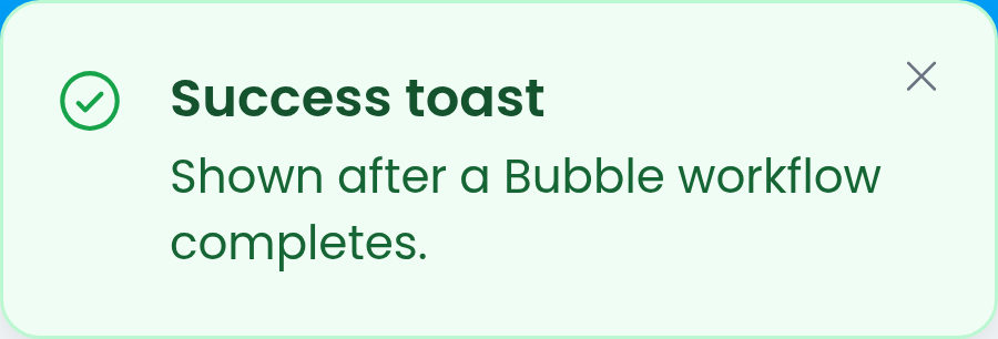
Show a confirmation after saving a thing:
Add Send toast notification after the create or make-changes step.
Set Title to
Saved.Set Description to
Your changes have been saved.Set Style to
Success.Set Duration (ms) to
3500.Set Position to
Top Right.
Show a validation error:
Add Send toast notification before stopping the workflow or before the user continues.
Set Title to
Missing information.Set Description to explain what the user needs to fix.
Set Style to
Error.Set Duration (ms) to
0if the message should stay visible until dismissed.Set Close button to
Always Xwhen the user should be able to dismiss it clearly.
Show a loading message:
Add Send toast notification before a slow client-side action.
Set Style to
Loading.Use a short Duration (ms), or set it to
0only when you have another way to tell the user what happened next.
Send toast notification
Use this action for new workflows.
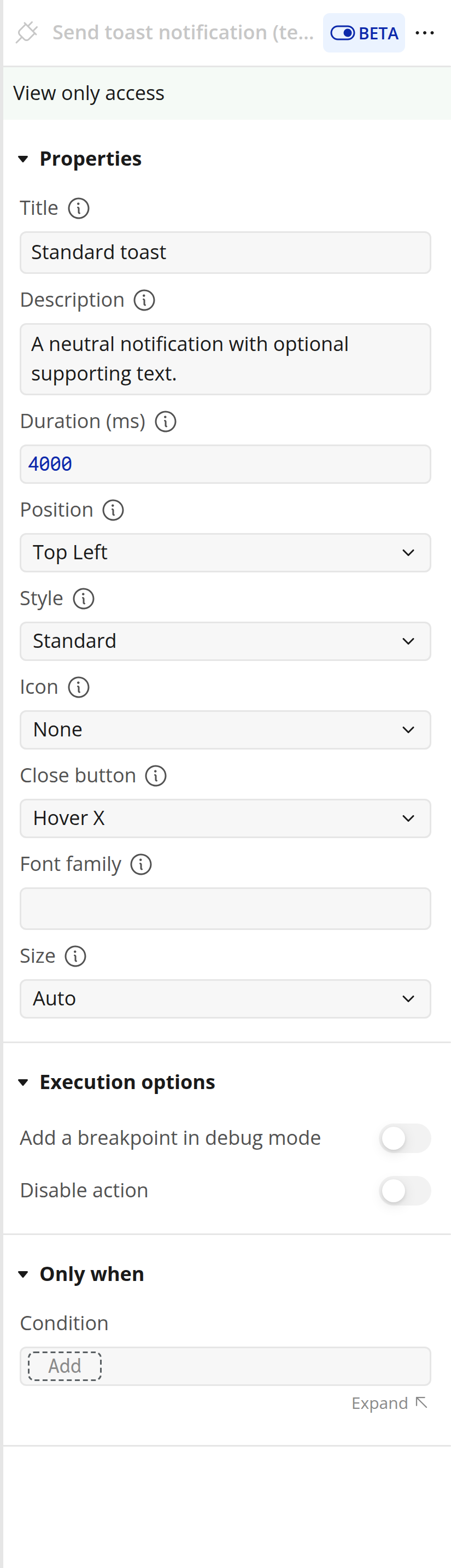
Title
Optional primary text for the toast. Use this for the short headline, such as Saved, Payment failed, or Export started.
Default: blank.
Description
Optional supporting text shown beneath the title. Use this for a short explanation or next step.
Default: blank.
Duration (ms)
How long the toast remains visible, in milliseconds.
Default: 4000.
Use 0 to keep the toast visible until it is dismissed. Avoid combining 0 with Close button set to Disabled, because the user will not have a way to dismiss the toast.
Position
Where the toast appears on the page.
Options:
Top LeftTop CenterTop RightBottom LeftBottom CenterBottom Right
Default: Top Right.
Toasts keep the position they were created with. For example, you can show one toast in the top left and another in the bottom right without the first toast moving.
Style
Choose a preconfigured visual style.
Options:
Standard- neutral toast. Uses no icon by default.Info- informational toast.Loading- loading toast with a spinning icon by default.Success- confirmation or completed-action toast.Error- failure, blocked action, or destructive issue.Warning- caution or important notice.
Default: Standard.
Icon
Choose the icon shown on the left side of the toast.
Options:
Auto- uses the default icon for the selected Style. Standard shows no icon.None- hides the icon.InfoCheckErrorWarningLoadingSparkleWandBellStarHeart
Default: Auto.
Close button
Controls whether the toast can be dismissed manually.
Options:
Hover X- shows the close button when the user hovers over the toast.Always X- always shows the close button.Disabled- hides the close button.
Default: Hover X.
Font family
Optional. Leave this blank to use the app's default Bubble font.
If you want a different font, enter the font family name as text. The font must already be available in the page for the browser to render it.
Default: blank.
Size
Choose the typography size preset.
Options:
Auto- comfortable default sizing.Compact- smaller text and tighter spacing.Comfortable- the normal readable size.Large- larger text and icon sizing.
Default: Auto.
Legacy action
The action Send toast notification - legacy remains available so existing workflows keep working. Use Send toast notification for new workflows unless you specifically need one of the older customization controls.
Legacy fields:
Title (Optional) - optional title text.
Message - main notification message.
Timeout - how long the legacy toast remains visible, in milliseconds.
Background color - toast background color.
Position -
Center,Top Left,Top Center,Top Right,Bottom Left,Bottom Center, orBottom Right.Animation In - opening animation.
Animation Out - closing animation.
Font Name (Title) - title font family.
Font Name (Message) - message font family.
Font Weight (Message) - message font weight.
Font Weight (Title) - title font weight.
Font Color (Message) - message text color.
Font Color (Title) - title text color.
Font Size (Message) in px - message font size.
Font Size (Title) in px - title font size.
Show Progress Bar - shows or hides the legacy progress bar.
Progress Bar Color - progress bar color.
Icon -
None,Info,Success,Error, orWarning.Icon Color - legacy icon color.
Image URL - optional image shown beside the message.
Image Width - width for the image, in pixels.
Moving from legacy to the new action
You can migrate one workflow at a time.
Move Title (Optional) to Title.
Move Message to Description.
Move Timeout to Duration (ms).
Choose a Style instead of manually setting background and text colors.
Choose Icon instead of combining icon color/image settings.
Use Font family only when you want to override the app's default font.
If your legacy toast uses
Center, choose the closest new position. The new action supports edge and corner positions, but not center-screen blocking notifications.
The legacy action is not removed, so existing workflows do not need to be changed immediately.
Troubleshooting
Nothing appears when the workflow runs:
Make sure the action is running in a page workflow or another browser-side workflow.
Check that the workflow condition is true.
Confirm the page has finished loading before the workflow runs.
Add at least a title or description so the toast has visible text.
The toast disappears too quickly:
Increase Duration (ms).
Set Duration (ms) to
0when the toast should stay visible until dismissed.
The close button is missing:
Check Close button.
Disabledhides it.Hover Xonly shows the close button when the user hovers over the toast.
The font looks different from the rest of the app:
Leave Font family blank to use the app's default Bubble font.
If you enter a custom font family, make sure that font is loaded by the page.
The loading toast does not turn into a success or error toast:
Each action creates a new toast. To show a result after a loading message, run another Send toast notification action with Success or Error when the next workflow step finishes.
Limits
The plugin is web-only.
Toasts are shown in the user's current browser tab. They are not emails, push notifications, or native mobile notifications.
The new action uses preset visual styles. Use the legacy action only when you need the older freeform color and animation controls.
A toast with Duration (ms) set to
0and Close button set toDisabledcan remain on screen until the page changes or reloads.